My Favourite Photo Exhibition in Stockholm
Sometimes I hate being in Stockholm Central, or any city center for that matter, especially on the weekend. I hate crowds and get sensory overloaded easily. Herds of commuters barrage the steps of the tunnelbana when I try to escape into the fresh air. Emerging from the station after my pendeltåg commute, I walk into the hustle and bustle of the city. A man sells hot dogs just around the corner, down from him are street preachers shouting at tourists and groups of teens about the road to God. The crowds are tight and Swedes, for some reason seem to have little awareness of the people around them and tend to stop dead in their tracks whilst walking, and if you bump into them, it’s your fault.
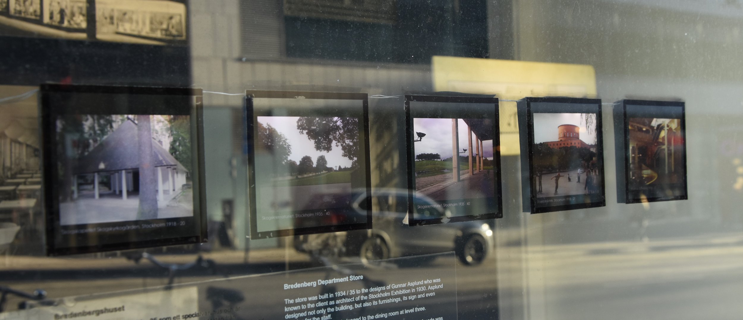
I try to avoid getting off the train here. Sometimes I will escape a stop earlier and explore the back streets for a quieter route. One day, I was so overwhelmed by the noise, the bodies and the smells, that I turned down the first street I could. It was the wrong way to work but I was early so I could take my time. Stopping to zip up my coat, I ambled over to, what looked like a closed shop front, out of the way of foot traffic, and lent against it. When I looked up at the window to gaze inside, I was met by a row of five, LED lit, colour transparencies. They seemed to each depict a different building or area, each with a title and year underneath. They had been propped up against the glass and each had a light running along the top to illuminate the image underneath. Maybe an art exhibition? I had heard of groups who took over old shop fronts in the city to put on events, so I thought it most likely. I took a step back to have a better look.
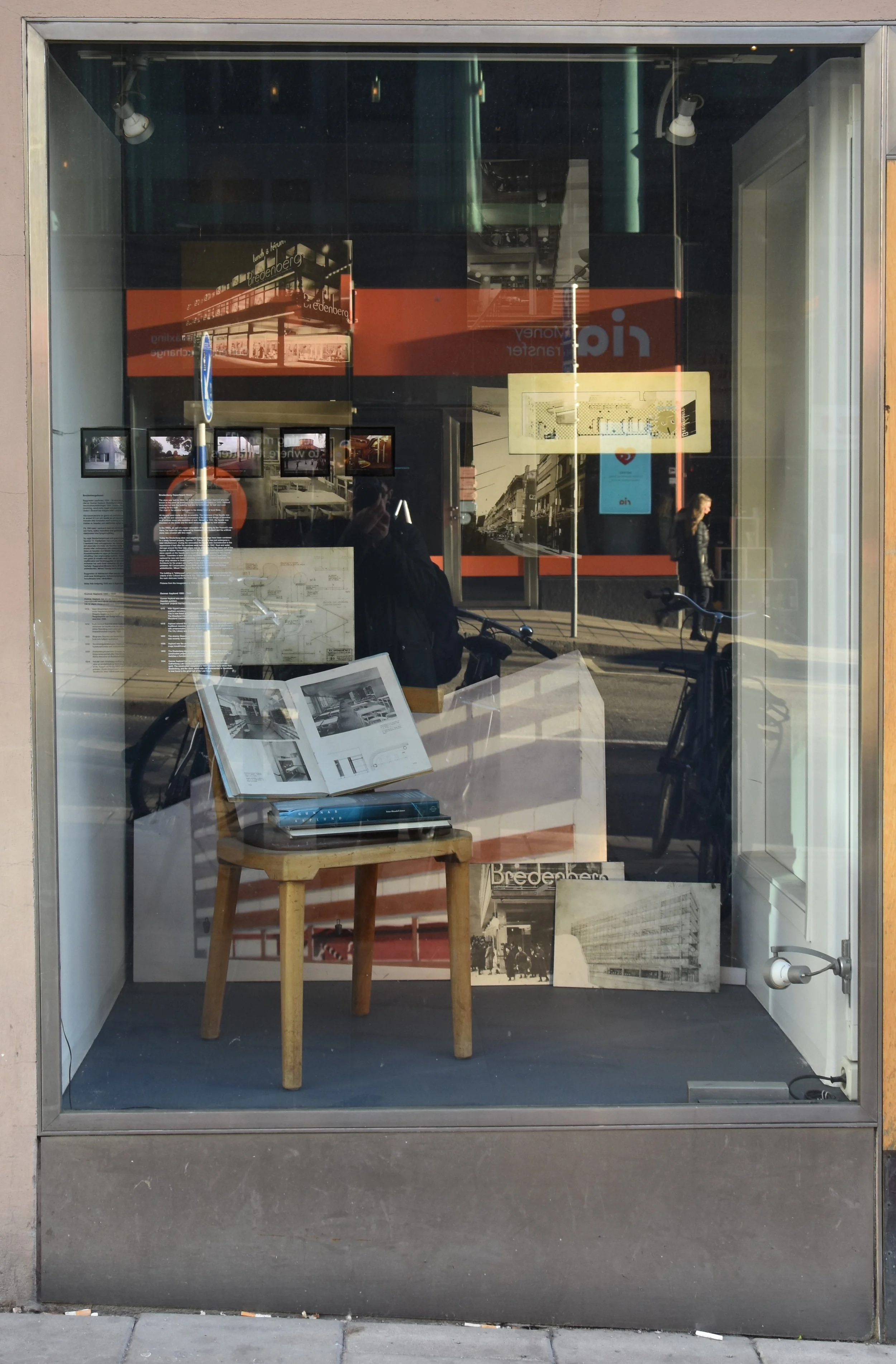
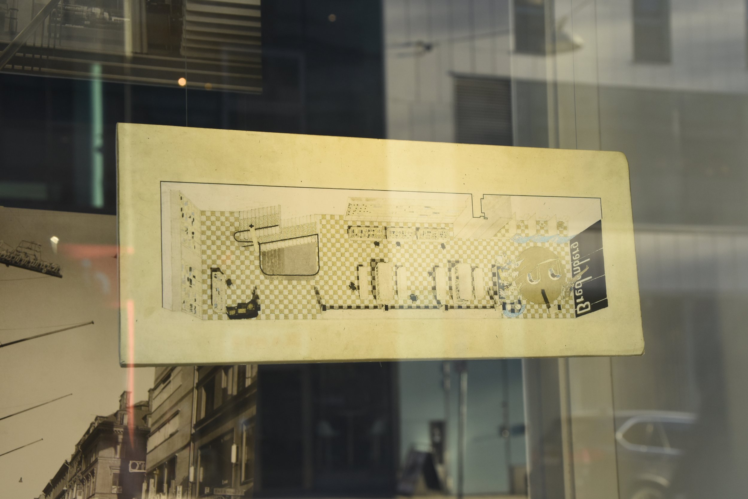
Exhibit on Mäster Samuelsgatan, Stockholm. Also I apologise for the image quality, ever time I tried to take photographs of the exhibit, it was for some reason, very sunny. In Stockholm. Can you believe it?!
During my MA, we were asked to choose between two modules to study. One of them was Photography and Industry, and the other was Museum and Exhibition Design. The later hooked me from the get go and I could not wait to get started. There was a slight issue when me and my course mates arrived to the class however. It was heavily design focused. Clue is in the name there Molly.. Well yes, but I thought we would get taught a little bit about design, as it had been offered to us, the non design students, as a module that we could select. Our classes were a mix of interior, graphic and general Design students, and then there was us. A small motley crew of Photo Historians, some of which had photography backgrounds, others History. Our first task was difficult. Choose an exhibition and explain how it could be improved through design features. Before we were really taught about said design features. But we powered through. Hitting the library and starting from what felt like scratch. Researching, examining and presenting our findings. We passed.
Near the end of the module we were eventually taught about practicalities of exhibition and museum design. We had some really great lectures and guest speakers, one even by the team who designed the latest Stone Hendge visitor centre. One day we had a lecture on the use of Photography in Museum exhibitions. This varied from digital prints of images (for example to illustrate events being discussed such as parties or historical moments), framed portraits, photographic objects for display (such as magazines, advertisements and collectable cards), photograph blow ups which were used as wallpaper or a backdrop for exhibits and Photos as historical objects themselves. Although it felt a little too late, it was still information we could at least take into the rest of the course and beyond the walls of the university.
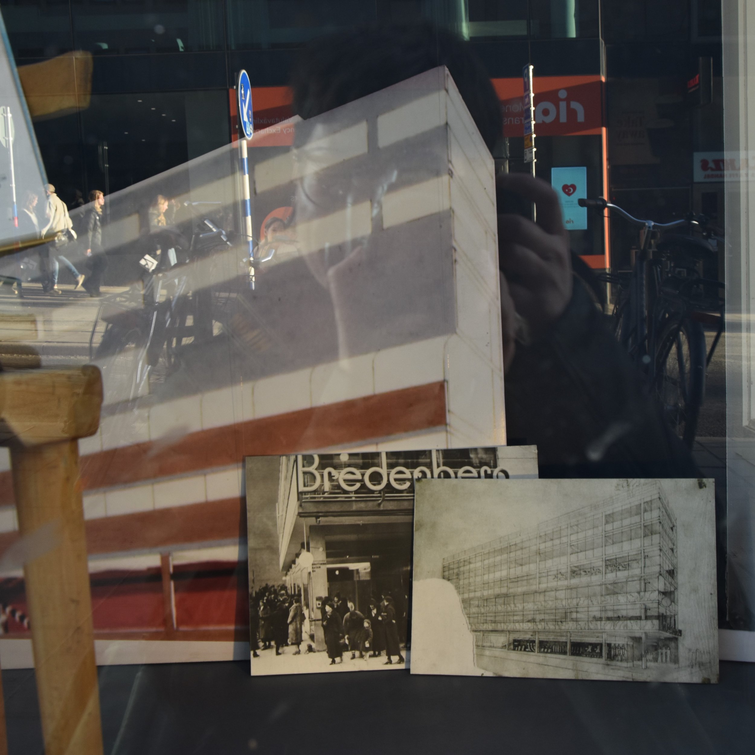
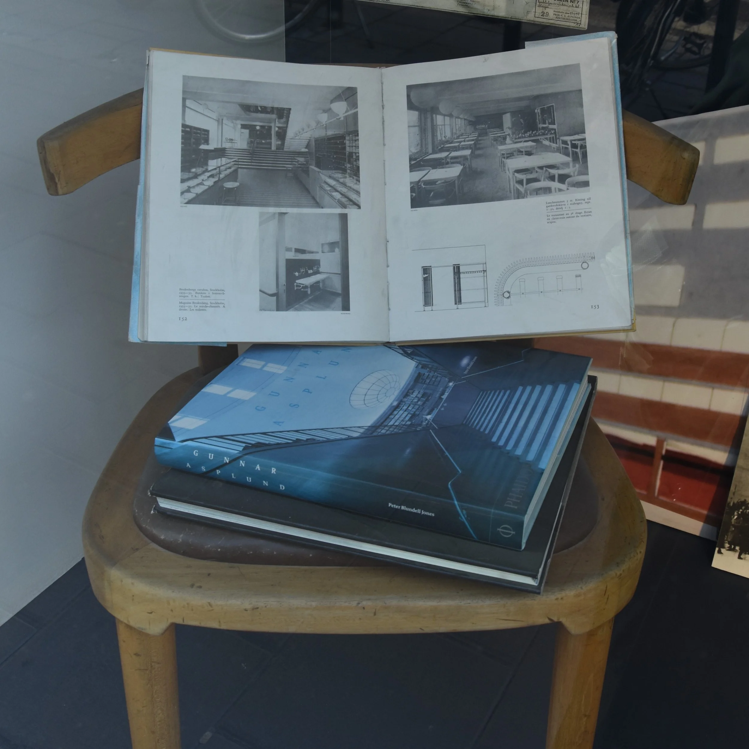
The window must have been about 1-2 metres wide, maybe a metre and a half in depth and around the height of a large door frame. At the back of the display were 4 black and white images, mounted and floated against the back wall. Two of these images were of the building from the exterior and two taken of the interior. There was one drawing floating in front, of what looked like a dining space. Below looked like plans and then a blown up pencil and colour design of a building exterior, printed onto the back wall. Beside this were two more images propped up against the wall. The last images of the exhibit were presented on the printed page. Three books stacked on the seat of a chair, one opened to a page displaying more images of the building interior. On the glass below the transparencies was text in Swedish and English explaining this charming exhibit. This exhibition displayed information, imagery and design related to the Bredenberg Department Store and its architect Erik Gunnar Asplund.
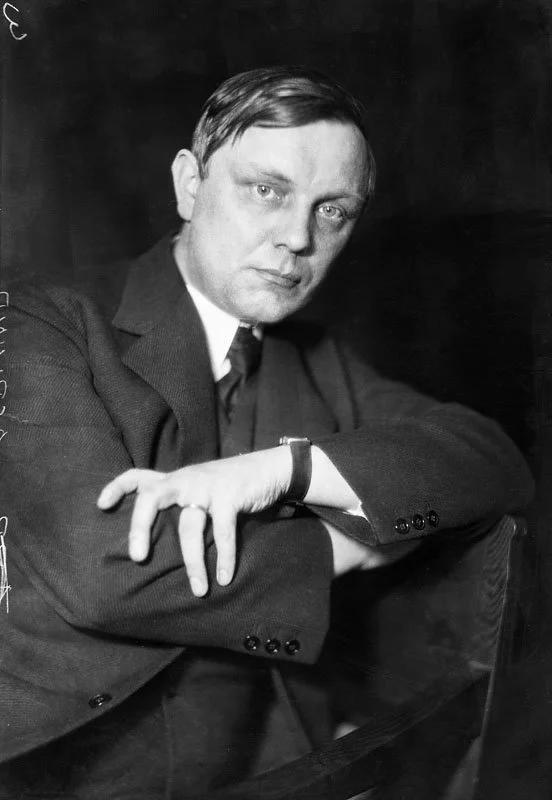
Gunnar Asplund by Jan de Meyere
Asplund, we learn, was one of Sweden’s most famous architects. The transparencies displayed are images of some of his previous architectural designs and collaborative projects such as the Skogskyrkogården, a UNESCO heritage Cemetery and the Stockholm Stads Library. Asplund had designed the Stockholm Exhibition in 1930 and the Bredenberg Department store was his first major construction project, taking place in 1934/35. He not only designed the building but the signage, clothing for staff and furnishings. The chair in the window was taken from the third floor dining room. I adored the various uses of not only designs but photographs, physical objects and text.
I was delighted with the different kinds of photography and photographic objects used in a display about architecture. Such a wonderful little photographic exhibition, hidden in plain sight. Now, when I have the odd spare moment before work, I no longer hop off a stop early. I brave the crowds, weaving between eager shoppers, fashionable swedes, clumsy tourists and make my way to Mäster Samuelsgatan, to gaze upon my favourite photo exhibition in Stockholm.
